Statistics is tricky. It’s easy to be fooled.
Outline
Statistics
- Statistics is the branch of mathematics dealing with presenting, summarizing, and making inferences from data.
- Descriptive Statistics is concerned with presenting and summarizing data.
- Inferential Statistics deals with making inferences from data.
- View Statistics Overview
Three Ways a Statistic Lies

1. The statistic is bogus
- A statistic is a mathematical calculation on the data. A statistic is bogus if the math is wrong or the data is bad.
- Example:
- “60,000 riders lost their lives last year from ferris wheel falls.”
2. The statistic is misleading
- A valid statistic can still mislead
- Example:
- “The average person has one testicle.”
3. The statistic is the basis for an invalid inference
- People make bad inferences from good statistics.
- Example:
- “The rotational velocity of a wind turbine is correlated with the speed of the wind: the greater the one, the greater the other. The wind turbine obviously acts like a propeller, making the wind blow.”
1. Bogus Statistics
A statistic is a mathematical calculation on the data.
A statistic is bogus if the math is wrong or the data is bad.
- A bogus statistic may be
- a calculation based on questionable or unverified data
- a “statistic” without data
- an estimate rather than an actual statistic
- a zombie statistic from the ether
- Questions
- What data is the statistic based on?
- How was the statistic calculated?
A statistic based on unverified data: 5,200 deaths caused by vaccines
Claim: “There is a risk to the vaccine. Again, it’s very small, but there are some pretty serious side effects, including death. We are already over 5,200 deaths reported on the VAERS system. That’s a CDC, FDA’s early warning system.”
- Sen. Ron Johnson (R-Wis.), in an interview on “Hannity” on Fox News, July 14, 2021
- “There is a risk to the vaccine. Again, it’s very small, but there are some pretty serious side effects, including death. We are already over 5,200 deaths reported on the VAERS system. That’s a CDC, FDA’s early warning system.”
- Four Pinocchios for Ron Johnson’s campaign of vaccine misinformation WaPo Fact Checker
- Johnson cited reports from the Vaccine Adverse Event Reporting System, a database co-managed by the CDC and the Food and Drug Administration, and he said death was a rare but possible effect of a coronavirus vaccination.
- The VAERS database does not say coronavirus shots caused the reported deaths. Anyone can submit a report to VAERS; they are not verified.
- About The Vaccine Adverse Event Reporting System (VAERS) CDC
- The Vaccine Adverse Event Reporting System (VAERS) database contains information on unverified reports of adverse events (illnesses, health problems and/or symptoms) following immunization with US-licensed vaccines. Reports are accepted from anyone and can be submitted electronically at www.vaers.hhs.gov.
- Disclaimer
- VAERS accepts reports of adverse events and reactions that occur following vaccination. Healthcare providers, vaccine manufacturers, and the public can submit reports to VAERS. While very important in monitoring vaccine safety, VAERS reports alone cannot be used to determine if a vaccine caused or contributed to an adverse event or illness. The reports may contain information that is incomplete, inaccurate, coincidental, or unverifiable. Most reports to VAERS are voluntary, which means they are subject to biases. This creates specific limitations on how the data can be used scientifically. Data from VAERS reports should always be interpreted with these limitations in mind.
An estimate posing as a statistic: 58,000 kids abducted
Claim: “According to the FBI’s latest study, more than 58,000 kids were abducted by non-relatives in one year.”
- NBC Nightly News report on Jan. 16, 2015
- “According to the FBI’s latest study, more than 58,000 kids were abducted by non-relatives in one year.”
- 58,000 children ‘abducted’ a year: yet another fishy statistic WaPo Fact Checker
- The number is derived from data collected between 1997 and 1999, mainly from a telephone survey in 1999 of 16,111 adult caregivers and 5,015 youths. The results were then weighted based on U.S. Census data.
- So, first off, you see this is an estimate, based on a survey, not based on actual incidents. NBC News claimed this was FBI data, which makes it sound like real crimes, but instead this was simply derived from a study conducted by academics for the Justice Department.
- But the report warns that “these numerical estimates are quite imprecise and could actually be quite a bit smaller or larger because they are based on very small numbers of cases.” One of the footnotes is emphatic: “Estimate is based on an extremely small sample of cases; therefore, its precision and confidence interval are unreliable.”
A “statistic” with no data: 40% higher excess mortality
Claim: Europe’s excess mortality during the COVID-19 pandemic is 40% higher than America’s.
- Trump Touts Misleading and Flawed Excess Mortality Statistic FactCheck.org
- It’s unclear how the president arrived at his 40% higher excess mortality figure. We asked the White House repeatedly for a source for the statistic and for more information on how it was being calculated, such as how Europe was being defined, but we did not receive a reply.
- So we dug into available estimates of excess mortality and also asked experts at the University of Oxford, Janine Aron and John Muellbauer, who had written a primer on excess mortality for the website Our World in Data.
- The data we found do not support the president’s claim — at least not in any fair comparison of excess mortality. And an independent analysis triggered by our query revealed that when the most comparable part of the U.S. is stacked up against the hardest-hit countries in Europe, America fares worse — not better — on measures of excess mortality.
A zombie statistic: US trafficking a $9.5 billion business
Claim: “This [human trafficking] is domestically a $9.5 billion business.”
- Rep. Ann Wagner (R-Mo.), remarks at a congressional hearing, May 14, 2015
- “This [human trafficking] is domestically a $9.5 billion business.”
- The false claim that human trafficking is a ‘$9.5 billion business’ in the United States, WaPo Fact Checker
- The 2006 State Department Trafficking in Persons report says:
- “According to the U.S. Federal Bureau of Investigation, human trafficking generates an estimated $9.5 billion in annual revenue.”
- First of all, although Wagner chose to interpret this as a figure for the United States alone, that is wrong. The report clearly states this is a worldwide estimate.
- But there’s a bigger problem: This is not an FBI estimate. FBI officials, after checking the files, say they have no record of having produced such a figure; certainly, they say, no such report was issued.
- The 2006 State Department Trafficking in Persons report says:
2. Misleading Statistics
A valid statistic can still mislead
- Apples to Oranges
- Average isn’t always typical
- Bad Measure of a Quantity
- Broad and Narrow Definitions
- Cherry Picking
- Dishonest Graphs
- Wrong Baseline
Apples to Oranges: Comparing incommensurable statistics
Comparing populations with different age distributions (where age is a factor)
Claim: 12% of all Indigenous Australians have long-term circulatory problems compared to 18% of the overall Australian population. So, regarding circulatory diseases, Indigenous Australians are healthier.
- Wikipedia
- However, in each age category over age 24, Indigenous Australians have markedly higher rates of circulatory disease than the general population:
- 5% vs 2% in age group 25–34
- 12% vs 4% in age group 35–44
- 22% vs 14% in age group 45–54
- 42% vs 33% in age group 55+
- The percentage of Indigenous Australians under 25 is much larger than the percentage of all Australians under 25. This skews the comparison, since younger people are healthier.
- The age-adjusted rate of circulatory disease among Indigenous Australians is 23.4 percent.
- However, in each age category over age 24, Indigenous Australians have markedly higher rates of circulatory disease than the general population:
- The age-adjusted rate of X is the average of the crude rates of X for each age group, weighted by the proportion of the general population in that age group
- Example
- General Population
- Percent of young = 25%
- Percent of older people = 75%
- Subpopulation of 1000
- Of 500 young, 5 have X, i.e. 1 percent
- Of 500 older people, 50 have X, i.e. 10%
- So crude rate of X in subpopulation = 55 / 1000 = 5.5 percent
- Age-adjusted rate of X in subpopulation = (0.25 * 1) + (0.75 * 10) = 7.75 percent
- General Population
Comparing college students to the entire US population
Claim: Whites in college are underrepresented
- Fox News uses misleading statistics to suggest that white students are underrepresented in college Media Matters
- America’s Newsroom co-host Shannon Bream presented two tables, stating:

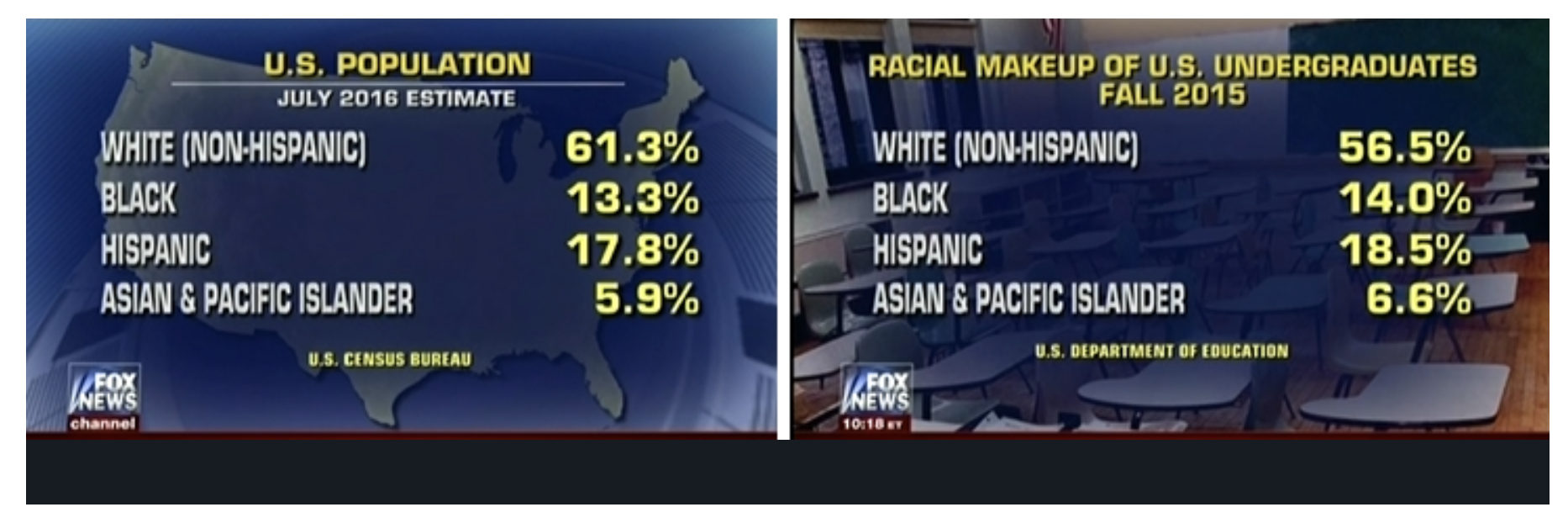
- “OK, I want to put up some numbers here just so people have a little bit of data in front of them to look at the official population estimates [left table]. This is the overall U.S. population. You can see the statistics there and you have the white population at 61.3 percent, and then a breakdown between black, Hispanic, and Asian and Pacific Islanders. Now when you look at those [right table], the racial makeup of U.S. undergraduate students, it’s about 5 percent lower for white students and slightly higher for each of the other groups represented there.”
- By presenting these charts together, Bream is comparing apples to oranges. The racial composition of the entire U.S. population (in the left table) is substantially different from the racial makeup of 18- to 24-year-olds, the predominant undergraduate college-age population (right table).
- According to the Department of Education, the 18- to 24-year-old population in the United States in 2015 was estimated to be
- 55.7 percent white
- 14.2 percent black
- 22.3 percent Hispanic
- 4.5 percent Asian or Pacific Islander.
- While it is unclear what Education Department data Fox News was citing to describe the “racial makeup of U.S. undergraduates” in “Fall 2015,” the National Center for Education Statistics indicates that the demographic breakdown of enrolled college students in 2015 was
- 57.6 percent of students were white,
- 14.1 percent were black,
- 17.3 percent were Hispanic
- 6.8 percent were Asian/Pacific Islander.
- According to these figures, whites were overrepresented in college by about 2 percent and Hispanics were underrepresented by 5 percent.
- America’s Newsroom co-host Shannon Bream presented two tables, stating:
Comparing hard data with estimates
Claim: “Eight Iowa Counties Have Total Registration Rates Larger than Eligible Voter Population – at Least 18,658 Extra Names on Iowa Voting Rolls.” (Judicial Watch)
- Report Prompts False Claims of ‘Voter Fraud’ in Iowa FactCheck.org
- A spokeswoman for Judicial Watch confirmed that the organization relied on two sets of data
- U.S. Census figures, which showed the county-by-county population of the Citizen Voting Age Population, or CVAP, based on the 2014-2018 American Community Survey five-year estimates
- 2018 total voter registration tallies from the Election Administration and Voting Survey by the U.S. Elections Assistance Commission.
- Justin Levitt, a law professor at Loyola Marymount University and voter fraud expert, recently wrote about the issue in a blog post after Judicial Watch issued legal threats to several states over their voter rolls.
- “Registration is a hard count of individuals, Census estimates of CVAP are survey estimates and projections. Among other things: the latter comes with a margin of error,” Levitt wrote. “These metrics cover different time periods. The CVAP estimates are estimates over a (usually) multi-year period, often several years behind any current snapshot of a registration count.”
- “They measure different things, at different times, with different types of levels of certainty,” Levitt said in an email to FactCheck.org. He said it’s “bad science to claim that a disconnect between those two numbers means that there’s fraud.”
- A spokeswoman for Judicial Watch confirmed that the organization relied on two sets of data
Comparing border apprehensions with Covid expulsions
Claim: “May was the third straight month of 170,000 apprehensions, which hasn’t occurred since 2000.”
- Rep. Elise Stefanik, in a news conference, June 29, 2021
- “May was the third straight month of 170,000 apprehensions, which hasn’t occurred since 2000.”
- Rep. Stefanik’s flawed comparison on border apprehensions since 2000 WaPo FactChecker
- But the comparison she makes is not apples to apples.
- The figures for March, April and May of this year mostly reflect individuals who are being expelled at the border regardless of their immigration status, under emergency public-health rules adopted to mitigate the spread of the coronavirus, according to U.S. Customs and Border Protection.
- The numbers from 2000 include only apprehensions under federal immigration law, in land areas between legal ports of entry.
Average isn’t always typical
- unSpun: Finding Facts in a World of Disinformation, Brooks Jackson and Kathleen Jamieson, 2007, Page 55
- “PRESIDENT BUSH sold his tax cuts to the public by claiming the “average tax cut” would be $1,586, but most of us were never going to see anywhere near that much.
- Half of Americans got $470 or less, according to the nonpartisan Tax Policy Center. Bush wasn’t lying, just using a common mathematical trick. When most people hear the word “average” they think “typical.” But the average isn’t always typical, especially when it comes to the federal income tax: very wealthy people pay a very large share of the taxes and stand to get a very large share of benefits when those taxes are cut.”
- Senses of “Average”
- a level typical of a group, class, or series (MWD)
- Mean = sum of values / number of values
- Mean[{10, 20, 20, 30, 40, 900}] = 170
- Median = value midway between lowest and highest
- Median[{10, 20, 20, 30, 40, 900}] = 25
- Mode = most frequently-occurring value
- Mode[{10, 20, 20, 30, 40, 900}] = 20
- Geometric Mean = nth root of product of n values
- Geometric Mean
- Suppose an investment loses 20 percent of its value in the first half of the year and gains 25 percent in the second. How did the investment perform over the year?
- The arithmetic mean yields an incorrect annual rate of return of 2.5%.
- Mean [-20, 25] = 2.5%
- The geometric mean gets the right answer.
- Geometric Mean [100 – 20, 100 + 25] – 100 = 0%
- For example, if the initial investment were $15,000, its value midyear would be 15000 – (0.2 * 15000) = $12,000. At the end of the year it would be 12000 + (0.25 * 12000) = $15,000.
- The arithmetic mean yields an incorrect annual rate of return of 2.5%.
- Suppose an investment loses 20 percent of its value in the first half of the year and gains 25 percent in the second. How did the investment perform over the year?
Bad measure of a quantity
Bad measure of dangerous driving conditions: absolute number of accidents
Claim: More accidents occur in clear weather than in foggy weather. Therefore driving in clear weather is more dangerous than driving in foggy weather. (Darrell Huff)
- How to Lie with Statistics, 1954, Darrell Huff
- Darrell Huff was a journalist who wrote how-to articles. How to Lie with Statistics is a classic.
- Chapter 7: The Semi-attached Figure
- If you can’t prove what you want to prove, demonstrate something else and pretend that they are the same thing. In the daze that follows the collision of statistics with the human mind, hardly anybody will notice the difference. The semi-attached figure is a device guaranteed to stand you in good stead. It always has.
- The only answer to a figure so irrelevant is “So what?”
Bad measure of workforce over time: absolute number of workers
Claim: “There are more Americans working today than ever before in American history.”
- Mike Pence, Speech at Tax Foundation, Nov. 16, 2017
- “There are more Americans working today than ever before in American history.”
- Washington Post Fact Checker
- “Of course there are more Americans working. That’s because there are more Americans today than ever before.”
- Number of workers
- A better measure is the labor participation rate, the percentage of the civilian population 16 or older working or actively looking for work.
Bad measure of vaccine effectiveness: percent of infected who are vaccinated.
Claim: The CDC reported that in a Covid outbreak in Provincetown, Mass, 74 percent of the 469 people infected were vaccinated. “Reality check! The vaccinated are the super spreaders!” (Instagram Post)
- Posts Misinterpret CDC’s Provincetown COVID-19 Outbreak Report FactCheck.org
- The statistic in question comes from a paper published on July 30 in the agency’s Morbidity and Mortality Weekly Report, which documents an outbreak of COVID-19 in Barnstable County, Massachusetts — elsewhere specified as Provincetown — that primarily occurred in vaccinated people, following large public events in the first half of the month.
- According to the report, of the 469 people included in the study who were in the area between July 3 and July 17 and tested positive for the coronavirus, 74% were fully vaccinated.
- But the 74% figure, while correct, can be misleading without the proper context, experts say, because as vaccination rates increase, it’s entirely expected for a larger and larger proportion of people who are infected to be vaccinated. It doesn’t mean the vaccines don’t work.
- Six Rules That Will Define Our Second Pandemic Winter, by Katherine J. Wu, Ed Yong, and Sarah Zhang Atlantic
- “If you’re trying to decide on getting vaccinated, you don’t want to look at the percentage of sick people who were vaccinated,” Lucy D’Agostino McGowan, a statistician at Wake Forest University, wrote. “You want to look at the percentage of people who were vaccinated and got sick.”
- Let’s work through some numbers. Assume, first, that vaccines are 60 percent effective at preventing symptomatic infections. Vaccinated people are still less likely to get infected, but as their proportion of the community rises, so does the percentage of infections occurring among them. If 20 percent of people are fully vaccinated, they’ll account for 9 percent of infections; meanwhile, the 80 percent of the population that’s unvaccinated will account for 91 percent. Now flip that. If only 20 percent of people are unvaccinated, there will be fewer infections overall. But vaccinated people, who are now in the majority, will account for most of those infections—62 percent.
- Lamb’s calculation:
- Assume
- 100 people are exposed to the virus
- Every unvaccinated person exposed to the virus get sick.
- Vaccines are 60 percent effective at preventing disease from exposure to the virus.
- First Scenario: 20 percent vaccinated
- 8 of 20 vaccinated get sick
- Solve[(20 – x)/20 == 0.6, x] = 8
- 80 of 80 unvaccinated get sick
- Solve[(80 – y)/80 == 0, y] = 80
- Percent of infections who were vaccinated = 8 / (80 + 8) = 9%
- Percent of infections who were unvaccinated = 80 / (80 + 8) = 91%
- 8 of 20 vaccinated get sick
- Second Scenario: 80 percent vaccinated
- 32 of 80 vaccinated get sick
- Solve[(80 – x)/80 == 0.6, x] = 32
- 20 of 20 unvaccinated get sick
- Solve[(20 – y)/20 == 0, y] = 20
- Percent of infections who were vaccinated = 32 / (20 + 32) = 62%
- Percent of infections who were unvaccinated = 20 / (20 + 32) = 38%
- 32 of 80 vaccinated get sick
- Assume
Bad measure of increase in number of young adults living with their parents: percent increase.
Claim: The number of young adults living with their parents increased 49 percent from 1970 to 2015.
- Why Percent Change is Actually Misleading (Most of the Time), Heather Krause Data Assist
- Stats
- In 1970, 12.5 million adult children (18-34 years old) lived with their parents.
- In 2015, the number was 18.6 million.
- That’s an increase of almost 49 percent
- (18.6 – 12.5) / 12.5) * 100 = 48.8
- But the main reason for the increase is the rise in the overall population, by 32 percent.
- Bottom line:
- The percentage of young adults living at home increased by less than a percentage point.
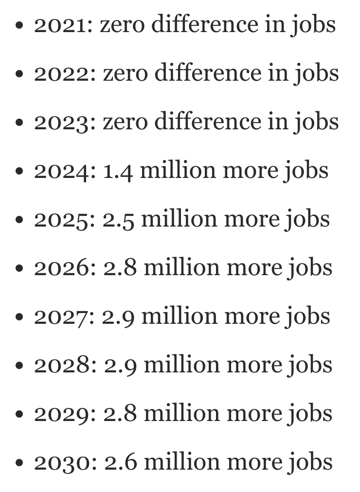
Bad measure of cost per job: cost of project divided by (number of jobs at end of project minus number of jobs at start of project)
Claim: “Each job created in Biden’s ‘infrastructure plan’ will cost the American people $850,000.”
- Republican National Committee, in a tweet, April 19
- “Each job created in Biden’s ‘infrastructure plan’ will cost the American people $850,000.”
- It’s easy to see how this number was calculated. The plan is estimated to add between 2.6 million and 2.7 million jobs to the U.S. economy over 10 years. Divide the cost of the plan by 2.6 million and voila, you end up with $850,000.But Mark Zandi said that if you are calculating a cost per job, you would not just use the overall gain in jobs in the last year of a 10-year period. You would also have to look at how many additional jobs were added each year and then were carried over into the next year.
- Mark Zandi is Moody’s Analytics chief economist.
- This is an economic term known as “job-year.” A job-year means simply one job for one year. For instance, a person who was hired in 2024 because of the infrastructure plan and stayed hired through 2030 would have worked for six “job-years.”When you look at Zandi’s spreadsheet of the difference in the number of jobs each year between implementing the infrastructure plan and not implementing it, you end up with this calculation:
- So, when you add that up, you end up with 17.9 million additional job-years over the decade.Zandi said it was “more appropriate … to divide the $985 billion in cumulative budget deficits over the 10-year period by 17.9 million jobs. This results in a cost of $55,000 per job-year.”
Bad measure of fake family units: large percent change of small number of fake families
Claim: “314 percent increase in adults showing up with kids that are not a family unit.”
- Former DHS Secretary Kirstjen Nielsen, White House briefing, June 18, 2018
- “Again, let’s just pause to think about this statistic: 314 percent increase in adults showing up with kids that are not a family unit. Those are traffickers, those are smugglers, that is MS-13, those are criminals, those are abusers.”
- Philip Bump, Washington Post
- There were 46 cases of fraud — “individuals using minors to pose as fake family units” — in fiscal 2017, the period from October 2016 through September 2017. In the first five months of 2018, there were 191 cases. That is an increase of 315 percent.
- (191 – 46) /46 = 315 percent
- There were 75,622 family units apprehended at the border in fiscal 2017, compared to 31,102 in the first five months of this fiscal year.
- That’s:
- 46 fake families out of 75,622 families apprehended in fiscal 2017 = 0.06 percent
- 191 fake families out of 31,102 families apprehended in the first five months of this fiscal year = 0.6 percent
- There were 46 cases of fraud — “individuals using minors to pose as fake family units” — in fiscal 2017, the period from October 2016 through September 2017. In the first five months of 2018, there were 191 cases. That is an increase of 315 percent.
Bad measure of progress combating pandemic: percent of emergency room visits for non-Covid health issues
Claim: “Thanks to our relentless efforts, 97% of all current emergency room visits are for something other than the virus.”
- Donald Trump, at campaign rally in Salem, Wisconsin, Oct 27, 2020
- “Thanks to our relentless efforts, 97% of all current emergency room visits are for something other than the virus. You don’t hear these numbers from the fake news. Think of that, 97%.”
- FactCheck.org
- “Trump’s statistic is correct, but it’s not the meaningful indicator he presents it as. Even during the pandemic’s harrowing days in April, the percentage of ER visits due to a COVID-like illness never went higher than 7%. And the number, while lower now, has been on the rise.
- A graph covering the pandemic period shows that the percentage of such visits each week peaked at 6.8% in April before declining and then hitting another peak of 4.2% in July. That means that even during the worst periods of the pandemic thus far, Trump would have been able to tout that 93% to 96% of ER visits were not related to COVID-19.”

Bad measure of global death rate: number of people who die at some point divided by number of people
Claim: “World Health Organization officials expressed disappointment Monday at the group’s finding that, despite the enormous efforts of doctors, rescue workers and other medical professionals worldwide, the global death rate remains constant at 100 percent.” (The Onion)
Using the wrong baseline to measure change
- A baseline is data used as a basis for comparison.
- An initial baseline is taken when a course of action begins, e.g. measurements of weight, heart rate, and blood pressure before starting an exercise program.
- A counterfactual baseline is what would have happened had a course of action not been pursued, e.g. evaluating proposed legislation by comparing its projected consequences with the projected consequences of the status quo.
- Scenario
- The government reduces tax rates and the following year tax revenues increase by 2%. It would seem that the effect of the tax cuts was to increase tax revenues by 2%.
- But …
- Tax cuts were projected to grow at 3% without the tax cuts. The effect of the tax cuts was thus to reduce tax revenues relative to what they would been otherwise, i.e. relative to the baseline.
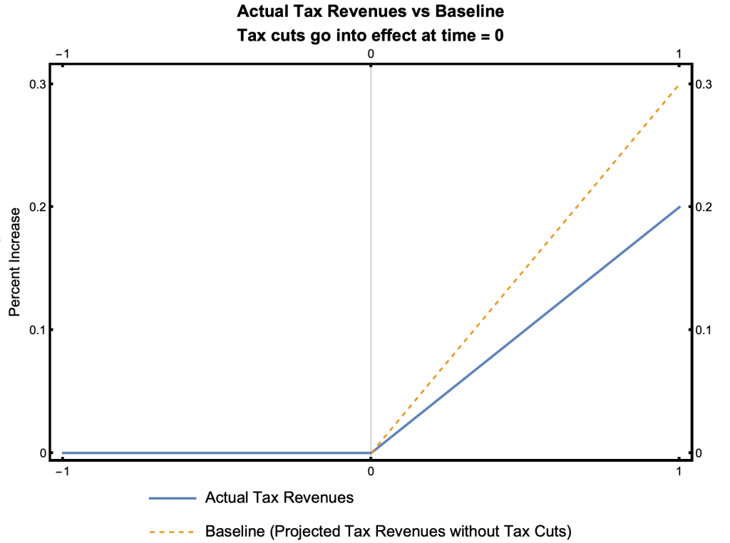
The correct baseline is revenues that would have been generated had there been no tax cuts
Claim: Federal revenues rose by 0.4 percent from the 2017 fiscal year to the 2018 fiscal year. Trump’s tax cuts thus paid for themselves in fiscal 2018, by bringing in more tax revenue than in the preceding year.
GOP baseline includes existing spending plans, Biden’s does not.
Claim: GOP’s infrastructure plan is $568 billion, compared to Biden’s plan of $2.2 trillion
- Apples to apples, the Senate GOP infrastructure proposal is smaller than it appears, WaPo Fact Checker
- The headlines were almost all universally the same — some variation of “GOP Counters Biden With $568 Billion Infrastructure Plan.” Just about every news report suggested that the headline-number offered for the Senate Republican plan was comparable to President Biden’s $2.2 trillion infrastructure plan.
- But when you are comparing two proposals, you have to make sure they are operating off the same baseline.
- A “current services” baseline generally is designed to measure the impact of policy changes in government spending and taxes vs. current policies. The baseline records what would happen if nothing is changed and current policies remain the same.
- The GOP wants its spending to look bigger, so it appears to include existing spending plans. Biden’s plan, by contrast, would largely be on top of the existing spending.
- In all, it looks like the GOP plan would add $189 billion to the baseline of current spending, compared to Biden’s $785 billion for the same line items.
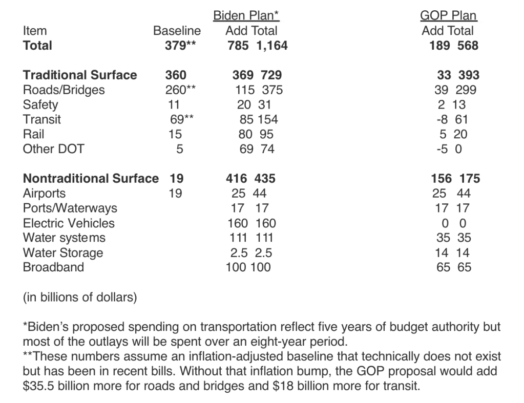
Image Credit: scribd.com/document/505114163/Biden-versus-GOP-infrastructure-plans-using-similar-baselines#from_embed
Cherry Picking: Selecting data that yields misleading statistics
Using a “convenient” start date
Claim: “Look at what’s going on in Europe: massive spikes….The U.K. is up 2,500 percent, the E.U.’s up 722 percent, and the United States is down 21 percent.”
- Donald Trump at the town hall debate on Oct 15, 2020
- “Look at what’s going on in Europe: massive spikes….The U.K. is up 2,500 percent, the E.U.’s up 722 percent, and the United States is down 21 percent.”
- Trump’s figures are from a graphic shown on Fox’s The Ingraham Angle that aired the day before.
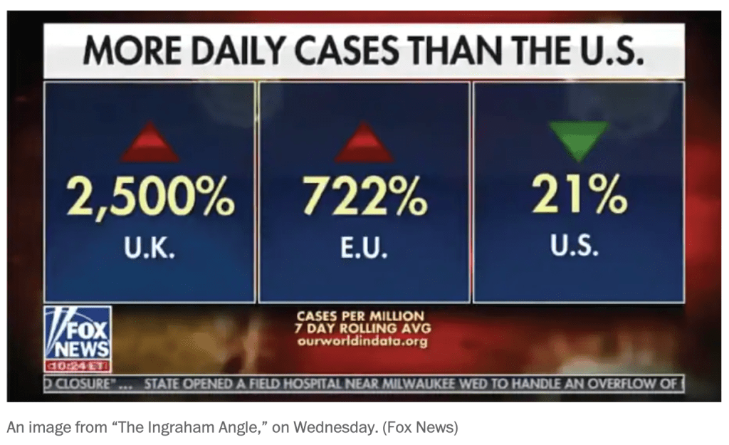
- The graphic shows percent changes in the 7-day rolling average of daily cases per million for the UK, EU, and US. But it doesn’t say for what time period.
- Reverse engineering the numbers, Philip Bump of the Washington Post calculated that the starting date was August 1, when US cases began a steep decline and the UK and UE started increasing. The red line on the graph below is the start date.
- The data was thus cherry-picked to make the UK and UE look bad compared to the U.S.
- Trump brought data from the Fox News universe to a debate centered in reality, Philip Bump, WaPo
- “A central point here is that the increases in the European Union (and, to a lesser extent, Britain) were so large precisely because those places had done a much better job controlling the virus.”

Using an unrepresentative dataset
Claim: Global warming stopped in 1998
- Climate Change Denial: Heads in the Sand, by Haydn Washington and John Cook
- Chapter 3: Five Types of Climate Change Denial Argument

- Did global warming stop in 1998? climate.gov
- No, but thanks to natural variability, volcanic eruptions, and relatively low solar activity, the rate of average global surface warming from 1998-2012 was slower than it had been for two to three decades leading up to it.
Broad and Narrow Definitions: Defining a statistic so it’s misleading
How Everytown changed its definition of “school shooting”
Claim: There have been lots of school shootings
- Everytown for Gun Safety used to track school shootings, which it defined as:
- “Incidents were classified as school shootings when a firearm was discharged inside a school building or on school or campus grounds, as documented by the press or confirmed through further inquiries with law enforcement.”
- FactCheck.org and the Washington Post Fact Checker criticized the definition as too broad:
- FactCheck.org
- The group’s list, however, overstates the number of school shootings by including incidents such as accidental discharges of firearms, suicide attempts and incidents in which no involved party was affiliated with the school.
- Everytown for Gun Safety is, of course, free to use whatever definition of “school shooting” it desires. But we find the group’s methodology overstates the number of school shootings. By our count, as of June 10, 2014, there had been 34 school shootings — not 74 — since the Sandy Hook shooting on Dec. 14, 2012.
- WaPo Fact Checker
- There are many ways to define school shooting. But applying the “reasonable person” standard, as is the standard at The Fact Checker, it is difficult to see how many of the incidents included in Everytown’s list — such as suicide in a car parked on a campus or a student accidentally shooting himself when emptying his gun and putting it away in his car before school — would be considered a “school shooting” in the context of Sandy Hook.
- FactCheck.org
- Everytown now tracks Gunfire on School Grounds in the United States
- everytownresearch.org/maps/gunfire-on-school-grounds/
- Gunfire on school grounds is defined as
- Any time a gun discharges a live round inside (or into) a school building, or on (or onto) a school campus or grounds, where “school” refers to elementary, middle, and high schools—K–12—as well as colleges and universities.
Different definitions of “mass shooting”
Claim: The number of mass shooting is ?
- What is a Mass Shooting? What Can Be Done? Richard Berk UPenn
- In the United States, there are several different, but common, definitions of mass shootings. The Congressional Research Service defines mass shootings, as multiple, firearm, homicide incidents, involving 4 or more victims at one or more locations close to one another. The FBI definition is essentially the same. Often there is a distinction made between private and public mass shootings (e.g., a school, place of worship, or a business establishment). Mass shootings undertaken by foreign terrorists are not included, no matter how many people die or where the shooting occurs.
- These formulations are certainly workable, but the threshold of 4 or more deaths is arbitrary. There are also important exclusions. For example, if 10 people are shot but only 2 dies, the incident is not a mass shooting.
- There also are inclusions that can seem curious because the motives of perpetrators are not considered when defining a mass shooting. For example, multiple homicides that result from an armed robbery gone bad are included. So are multiple homicides that result from turf wars between rival drug gangs.
- The heterogeneous nature of mass shootings needs to be unpacked as well. There are important differences between mass shootings in schools, places of worship, business establishments, outdoor rock concerts, private residences, and other settings. At the very least, there is reason to suspect that each is characterized by different kinds of motives.
- US Mass Shootings, Mother Jones
- A mass shooting is defined as a single attack in a public place in which three or more victims were killed.
- Mass Shootings in America, Everytown
- A mass shooting is any incident in which four or more people are shot and killed, excluding the shooter.
- Gun Violence Archive Shooting Tracker
- A mass shooting is a single event in which four or more people were shot and/or killed at the same general time and location, not including the shooter.
- Definitions of “Mass Shooting” Wikipedia
Dishonest Graphs: Distorting the data visually
- A graph is a diagram of geometric objects whose measurable attributes represent numeric data
- Geometric objects such as points, lines, rectangles, circles
- Measurable attributes such as distance, length, width, height, area, angles
- Graphs can mislead by using misleading statistics, e.g. cherry picking, comparing apples to oranges, and bad measures of a quantity.
- Graphs can mislead in ways unique to graphs, e.g. monkeying with scales.
Misleading chart shown at Planned Parenthood hearing, Linda Qiu Politifact
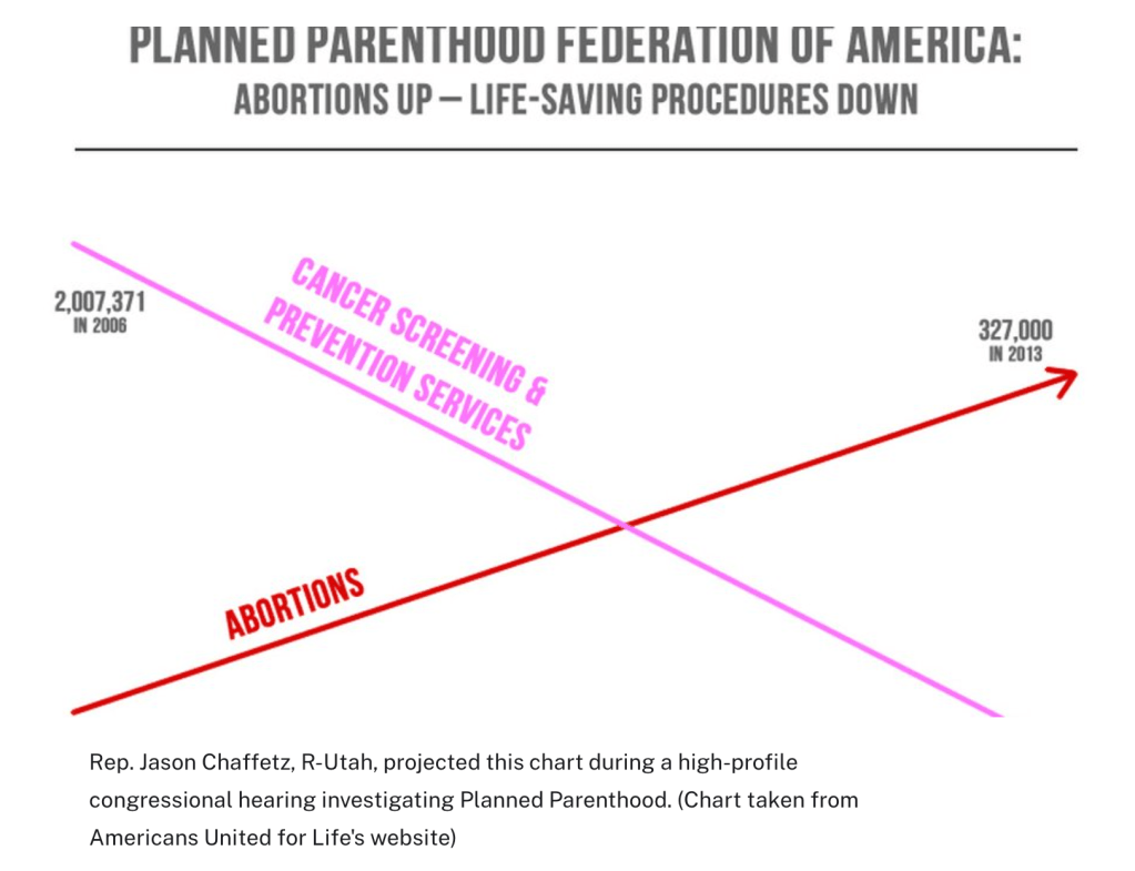
- A chart Rep, Jason Chaffetz’s presented at a congressional hearing falls into a category known as a dual-axis chart. On the left side, cancer screenings and prevention services are plotted in the millions. On the right side, abortions are plotted in the hundreds of thousands.
- But the way the chart was assembled is problematic.
- For starters, dual-axis charts are particularly susceptible to showing spurious correlations. With two axes, trend lines can be exaggerated and manipulated, as most people ignore the axis labels that put the numbers in context.
- Second, it’s even more inappropriate to use a dual-axis chart when comparing equivalent measures (in this case, the number of services performed by Planned Parenthood) using different scales, said Enrico Bertini, a professor at New York University who studies data visualization and who called the chart “scandalous.”
- Typically, dual-axis charts are used to compare lines that represent different things — “for instance, abortion rates and cost,” said Bertini. “But in this case the unit is the same.”
- “You cannot put two measures, one in the millions and one in the hundreds, without making it explicit,” Cairo said. “We map data into visual properties — height, length, color — but we need to keep the proportions. We cannot force the data to adopt a shape we like.”
- Finally, perhaps the most egregious decision was to not label the axes. Experts told us that, given this decision, they cannot rule out purposeful deception.”
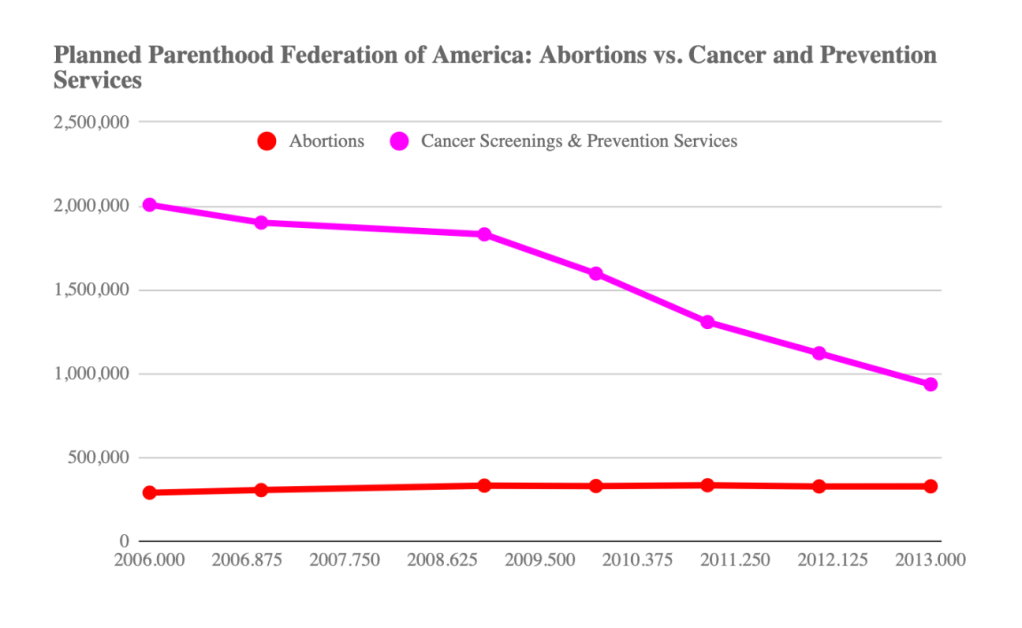
- With guidance from the experts, we compiled the number of abortions and cancer screenings/prevention services from Planned Parenthood’s annual reports from 2006 to 2013 (we could not find a report from 2008). Here’s what the chart should look like:
Truncated graph
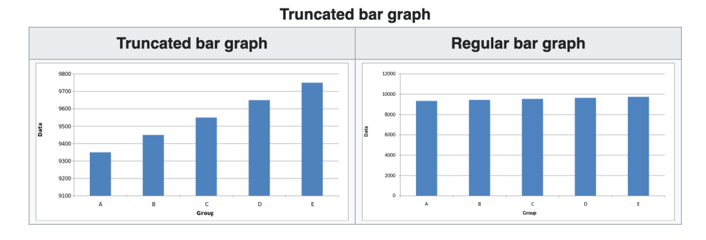
Image Source: wikipedia.org/wiki/Misleading_graph
3D Distortion
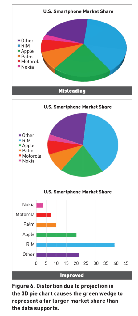
Image Source: cmci.colorado.edu/visualab/papers/p26-szafir.pdf
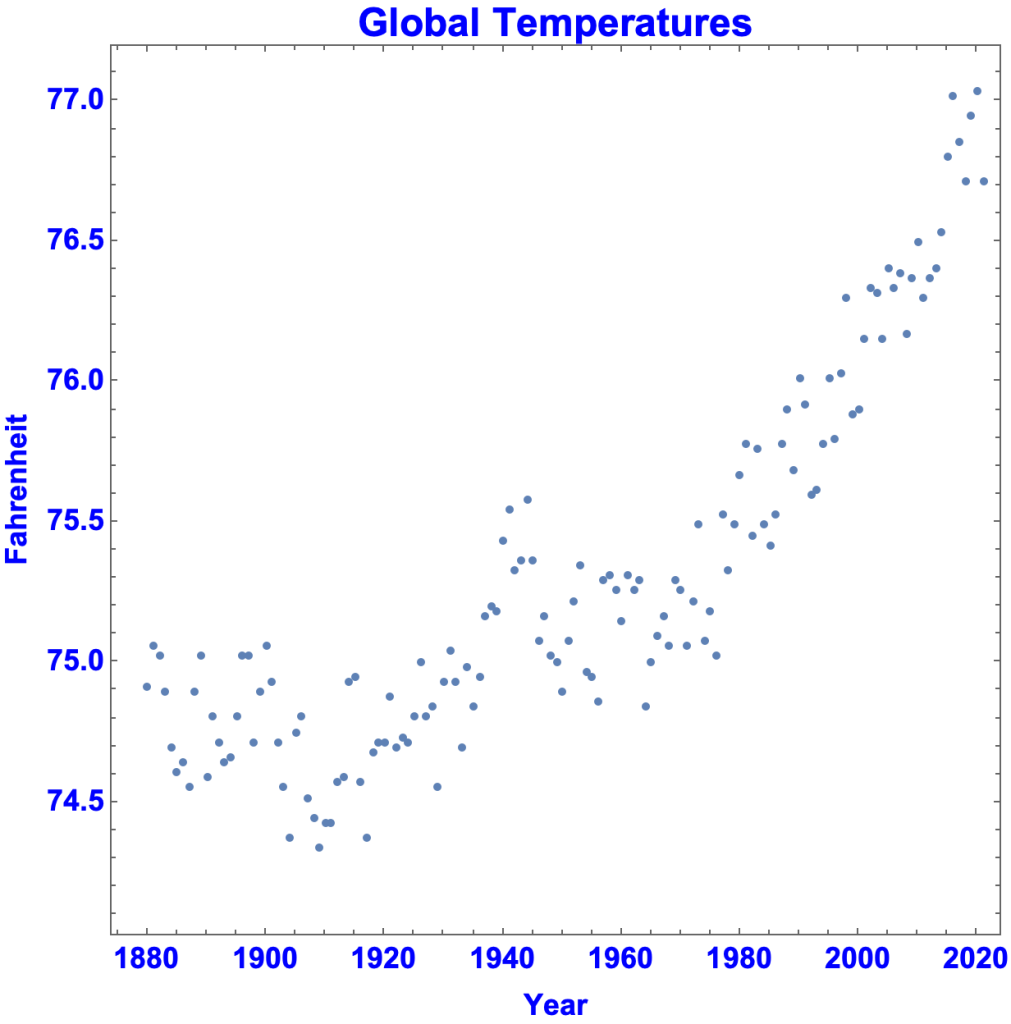
Differences in aspect ratios and range of axes
- A typical graph of global temperatures in Fahrenheit from 1880 to 2021 looks like this.
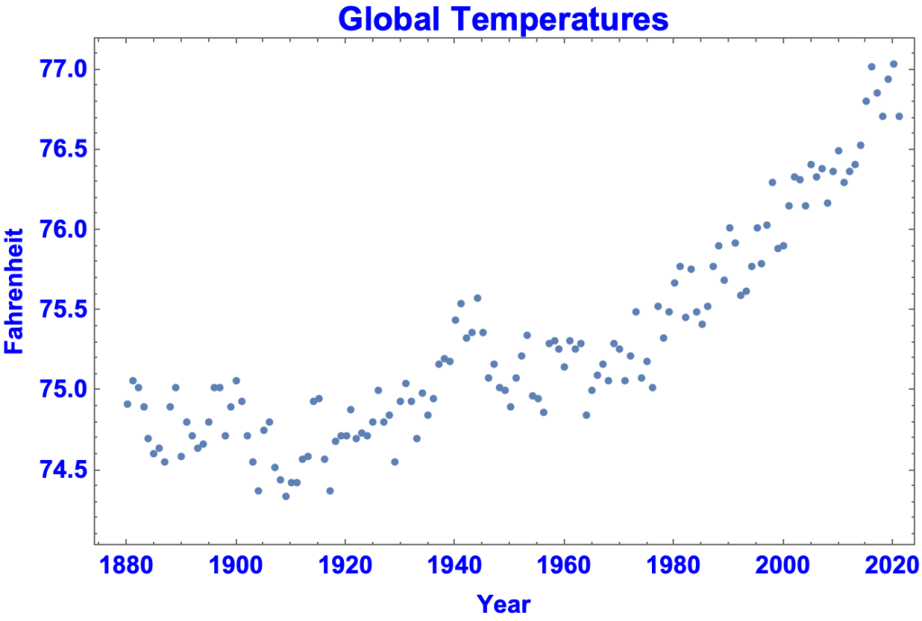
Generated using Mathematica (Descriptive Statistics.nb)
- By having the y-axis go from 0 to 100, the same data looks like:

Generated using Mathematica (Descriptive Statistics.nb)
- By changing the aspect ratio to 1/1, the graph looks like this
Generated using Mathematica (Descriptive Statistics.nb)
- View Interactive of Graph Varying Aspect Ratio
Linear vs Log plot
- A typical graph of atmospheric CO2 in parts per million:
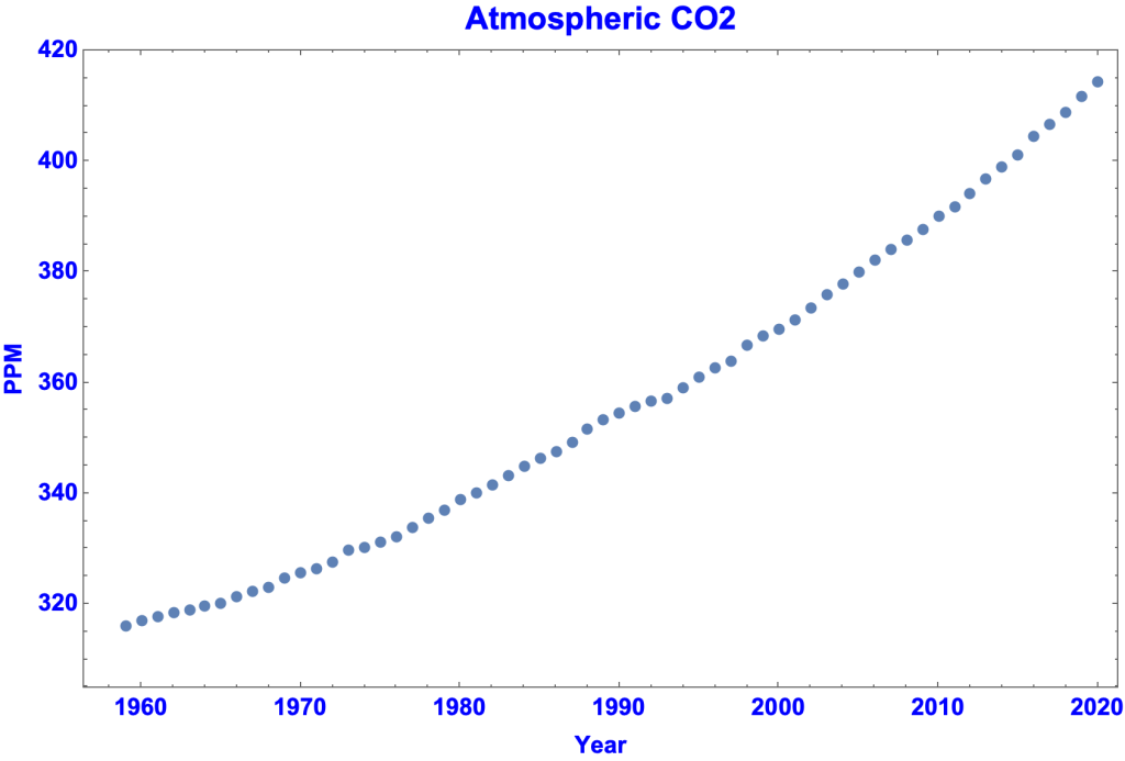
Generated by Mathematica, Descriptive Statistics.nb
- A log plot of atmospheric CO2:
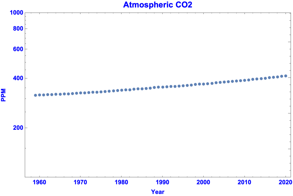
Generated by Mathematica, Descriptive Statistics.nb
3. Invalid Inference from a Statistic
People make bad inferences from good statistics
- Inferring Causation from a Statistic
- Inferring Causation from a Correlation
- Inferring Causation from a Study
- Generalizing
- Deductively Fallacious Statistical Arguments
Inferring Causation from a Statistic
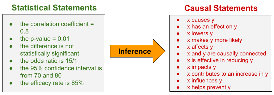
- Inferring causation from a statistic means inferring a causal statement from the statement of a statistic.
- Causal Statements:
- x causes y, x has an effect on y, x lowers y, x makes y more likely, x affects y, x and y are causally connected, x is effective in reducing y, x impacts y, x contributes to an increase in y, x influences y, x helps prevent y
- Statements of Statistics:
- The correlation coefficient = 0.8, the p-value = 0.01, the difference is not statistically significant, the odds ratio is 15/1, the 95% confidence interval is from 70 and 80, the efficacy rate is 85%
- A causal statement is not the result of a mathematical calculation on the data. It is not a statistic. It is inferred from a statistic.
- Inferring causation
- from a change in a variable, preceded by an event
- post hoc ergo propter hoc
- from a correlation
- to infer causation you need evidence beyond mere correlation
- from a study
- key difference between an observational study and a randomized controlled trial
- from a change in a variable, preceded by an event
Inferring Causation from a Change in a Variable, Preceded by an Event
- Post hoc ergo propter hoc (“after this, therefore because of this”) is the fallacy of inferring causation merely because one thing happened before another.
Biden taking office preceded rise in gas prices
Claim: “As millions of Americans travel this holiday weekend, they are feeling the cost of Biden’s policies at the pump. Gas prices are at their highest level in 7 years.”
- Ronna McDaniel, chair of the Republican National Committee, in a tweet, July 3, 2021
- “As millions of Americans travel this holiday weekend, they are feeling the cost of Biden’s policies at the pump. Gas prices are at their highest level in 7 years.”
- The bogus GOP claim that Biden is responsible for higher gasoline pricesWaPo Fact Checker
- So far this year, gasoline prices have risen 88 cents, or a 40 percent increase, to $3.13 a gallon on July 6.
- The biggest factor in the price of gasoline is crude oil. Well over 50 percent of the price at the pump is directly tied to the cost of crude oil. About 18 percent of the cost relates to state and federal taxes — the latter of which have not increased under Biden. About 15 percent stems from distribution and marketing, while 13 percent comes from refining costs and profits. (These figures are from AAA.)
- If you go back over 35 years of Energy Department data, there is almost a perfect — 95 percent — correlation between yearly crude prices and gasoline prices, Finley said.
- Mark Finley is a fellow at Rice University’s Center for Energy Studies
- So why has the cost of crude oil increased in recent months?
- “Oil demand was so low during the pandemic last year, oil producers decreased their production levels,” said Chris Higginbotham, a spokesman for the Energy Information Administration (EIA). “It takes time to ramp up production, so demand this year has increased far more quickly than production rates. That means there is less crude oil in storage, which pushes up the price of oil, making it more expensive to make gasoline.”
- “Crude prices are influenced by a number of factors — geopolitical tensions/decisions, production, demand, supply, etc.,” Jeanette McGee, a AAA spokeswoman, said in an email. “Right now the largest influences are increasing global demand, promise of leisure travel, optimism of vaccination rollout and OPEC+ failure to reach an agreement on production increases.”
- Higginbotham added that there were two other unique factors this year. “Texas’ extreme weather led to refinery shutdowns that contributed to tightness in the gasoline market just as pandemic-related restrictions were starting to ease,” he said. The Colonial Pipeline shutdown from a ransomware attack “happened just before summer driving season officially kicked off, so gasoline supplies got even tighter just as demand was really ramping up.”
- Finally, during the summer, the gasoline blend (which is less likely to evaporate in the heat) costs slightly more to produce than the winter blend. That shift adds a few pennies to the cost.
- So where’s Biden in all of this? Nowhere. As AAA’s McGee put it, “Gas prices fluctuate no matter who is in office.”
- Policy and the Fog of Politics, Krugman NYT
- The price of gasoline has risen about $1.50 a gallon from its pandemic lows:
- Yet presidents have very little influence on prices at the pump.
- In the current episode, what’s driving gas prices is a surge in the global price of crude oil. Here’s the price of Brent crude, that is, the price in European markets
- Crude is up more than $60 a barrel. And since there are 42 gallons in a barrel, this means that the price of the crude oil used to make a gallon of gasoline has risen by $1.50 — basically accounting for all of the rise in the price to consumers. That is, developments outside the control of any president are driving a price rise that is surely one factor in President Biden’s approval ratings.
Inferring Causation from a Correlation
- The correlation between two variables is the extent they vary together, in the same or opposite directions. Correlation is a mathematical relationship between pairs of numbers.
- View Correlation
- The correlation coefficient measures degree of correlation
- Correlation by itself doesn’t imply causation
- Correlation can be evidence of causation in conjunction with other evidence
- Possible explanations for a correlation between X and Y
- X causes Y
- Y causes X
- A third (confounding) variable causes both X and Y
- The correlation is a coincidence
- There’s no causal connection between X and Y
- To infer causation you need evidence beyond mere correlation.
Causal inference undermined by a plausible competing explanation of correlation
Claim: There’s a significant correlation between gun prevalence and firearm homicide rate. Therefore, more guns result in higher firearm homicide rates.
- The Relationship Between Firearm Prevalence and Violent Crime, Rand Corp
- Four of the six studies found the prevalence of firearms to be significantly and positively associated with homicide rates, and these associations were found across reasonably independent data sets. A fifth study found no significant effect of gun prevalence on the intimate partner homicide rate and the firearm intimate partner homicide rate, and a sixth study found significant negative effects (indicating that gun prevalence reduced violent crime) in the preferred specification.
- A fundamental limitation for all of the studies is the lack of direct measures of gun prevalence. All of the authors used the proportion of suicides that were firearm suicides as a proxy for gun prevalence
- While most of the new studies provide evidence consistent with the hypothesis that gun prevalence increases violent crime, there’s a basic problem inferring causation: if people are more likely to acquire guns when crime rates are rising or high (as suggested by, for instance, Bice and Hemley, 2002, and Kleck and Patterson, 1993), then the same pattern of evidence would be expected, but it would be crime rates causing gun prevalence, not the reverse.
Causal inference undermined by correlations with a third variable
Claim: “You hear about certain places like Chicago and you hear about what’s going on in Detroit and other — other cities, all Democrat run. Every one of them is Democrat run. Twenty out of 20. The 20 worst, the 20 most dangerous are Democrat run.”
- Donald Trump, at a White House event, June 25, 2020.
- “You hear about certain places like Chicago and you hear about what’s going on in Detroit and other — other cities, all Democrat run. Every one of them is Democrat run. Twenty out of 20. The 20 worst, the 20 most dangerous are Democrat run.”
- Trump keeps claiming that the most dangerous cities in America are all run by Democrats. They aren’t. Philip Bump WaPo
- It’s not clear how Trump is defining “most dangerous” in this context. So let’s look at two related sets of data compiled by the FBI: most violent crime and most violent crime per capita.
- Cities generally have more crime than suburban and rural areas. That’s been true for decades if not centuries and is true across the planet. The connection has been the focus of repeated research.
- Cities tend to be heavily Democratic. In the 2018 House elections, Democrats won every district identified by CityLab as being purely urban.
- Since there’s a correlation between size [of cities] and amount of crime and between size and propensity to vote Democratic, it’s problematic to draw a causal relationship between crime and Democratic leadership.
- This is a case of cum hoc ergo propter hoc, inferring causation merely because of a correlation.
Inferring Causation from a Study
- Statistical Hypothesis Testing is the use of a probability distribution to assess the extent a hypothesized causal connection is supported by the data, e.g. the effectiveness of a drug given the results of a clinical trial.
- View Key Difference Between:
- An observational study
- A randomized controlled trial
- View Vaccine Efficacy and Effectiveness
- Pitfalls
- Ignoring the risk of confounding variables in an observational study
- Misrepresenting, misunderstanding, misinterpreting, or cherry picking the results of a study
- Jumping to a conclusion, e.g. by failing to consider other relevant studies.
Confounding variable in an observational study
Claim: Birth order is linked to incidence of Down syndrome
- Understanding Confounding in Observational StudiesESVS
- A classic example of confounding refers to the observed correlation between birth order and the risk of Down syndrome, where the incidence of Down syndrome may seem to be linked directly to the position in birth order (i.e. the more older siblings, the higher the risk of Down syndrome). However, women giving birth to their second or third child are usually older than women giving birth to their first child. Thus position in birth order is linked to maternal age. If maternal age, in turn, was also linked to Down syndrome, the correlation between birth order and Down syndrome could potentially be explained (i.e. be confounded) by maternal age. Indeed, stratification by both maternal age and birth order (see below) shows clearly that the apparent predictor “position in birth order” does, in reality, not correlate independently with the risk of Down syndrome, but only via confounding by “maternal age”.
Cherry picking the results of a study
Claim: “A landmarkmark double-blind and placebo controlled trial demonstrated Prevagen improved short term memory, learning, and delayed recall over 90 days.”
- Does the supplement Prevagen improve memory? A court case is asking that question. (WaPo)
- One criticism raised by the FTC and New York attorney general lawsuit is that the company-funded test of the supplement doesn’t pass muster. Quincy Bioscience describes the study as a randomized, double-blinded, placebo-controlled trial.
- But, according to the FTC and the New York attorney general, the trial involved 218 subjects taking either 10 milligrams of Prevagen or a placebo and “failed to show a statistically significant improvement in the treatment group over the placebo group on any of the nine computerized cognitive tasks.” (ftc.gov, page 24)
- The complaint alleges that after the Madison Memory Study failed to “find a treatment effect for the sample as a whole,” Quincy’s researchers broke down the data in more than 30 different ways.
- “Given the sheer number of comparisons run and the fact that they were post hoc, the few positive findings on isolated tasks for small subgroups of the study population do not provide reliable evidence of a treatment effect,” the lawsuit said. Post hoc studies are not uncommon but are generally not regarded as proof until confirmed, scientific experts say.
- According to the Center for Science in the Public Interest, which filed an amicus brief in support of the agencies’ charges, the subsequent analyses produced “three results that were statistically significant (and more than 27 results that weren’t).”
Misrepresenting / misunderstanding a study’s results
Claim: Mask don’t work
- “When you talk about the peer-reviewed studies of masks, there was one done in Denmark, showed that it didn’t work.”
- Rand Paul in an interview on Fox News
- Effectiveness of Adding a Mask Recommendation to Other Public Health Measures to Prevent SARS-CoV-2 Infection in Danish Mask Wearers (Annals of Internal Medicine)
- Objective: To assess whether recommending surgical mask use outside the home reduces wearers’ risk for SARS-CoV-2 infection in a setting where masks were uncommon and not among recommended public health measures.
- Results: Infection with SARS-CoV-2 occurred for 1.8% of those who were recommended masks and 2.1% of control participants.
- The study is not evidence that masks don’t work.
- The study did not did not measure the “ability of masks to prevent spread of the virus from wearers to others.”
- Danish Study Doesn’t Prove Masks Don’t Work Against the CoronavirusFactCheck.org
- News of the results of a recent randomized controlled trial in Denmark testing a face mask intervention has led some to conclude that masks are ineffective against the coronavirus, or SARS-CoV-2.
- But scientists say that’s the wrong takeaway — and even the authors of the study say the results shouldn’t be interpreted to mean masks shouldn’t be worn.
- The trial evaluated whether giving free surgical masks to volunteers and recommending their use safeguarded wearers from infection with the coronavirus, in addition to other public health recommendations. The study didn’t identify a statistically significant protective effect for wearers, but the trial was only designed to detect a large effect of 50% or more. And the study didn’t weigh in on the ability of masks to prevent spread of the virus from wearers to others, or what’s known as source control, which is thought to be the primary way that masks work.
- Rand Paul’s false claim that masks don’t workWaPo Fact Checker
- The study, published in the Annals of Internal Medicine last year, found that the group wearing surgical masks was less likely to catch the virus than the unmasked group, but there was not enough evidence to reach a statistically significant conclusion.
Immortal time bias in an observational study
Claim: Hydroxychloroquine reduces deaths from COVID-19
- No New Revelation on Hydroxychloroquine and COVID-19 factcheck.org
- Conservative outlets, including One America News Network and Fox News, have recently publicized an observational study that hasn’t been peer-reviewed as having “confirmed hydroxychloroquine to be effective in the treatment of COVID-19,” as OAN put it. Fox News’ Laura Ingraham, in a June 1 segment, called it a “landmark study.”
- The unpublished observational study posted online in late May looked at 255 COVID-19 patients at Saint Barnabas who required invasive mechanical ventilation.
- It said 18 out of 37 patients who got a higher cumulative amount of hydroxychloroquine and azithromycin survived, compared with 36 surviving patients among the 218 who did not receive the higher cumulative amounts. From those figures, the study calculates a nearly 200% relative difference in survival.
- But the experts we interviewed told us the data weren’t analyzed properly.
- Dr. Neil Schluger told us the study most likely found the association between higher cumulative doses and survival because “in order to receive a higher cumulative dose you had to be alive.” The problem is called an immortal time bias. Patients weren’t randomized to get higher doses or not; instead it was done at the doctors’ discretion, Schluger said.
- Schluger said in an email that there were “several obvious differences that are striking” between the patients who survived and those who died, including that the latter were 13 years older on average. “That’s a huge difference, and age has always been the strongest risk factor for mortality.”
- Dr. David Boulware, too, told us the study suffered from an immortal time bias, which he called a “basic statistical concept.” The analysis compares “people who survived 10 days to people who did not survive 10 days,” he said in an interview. “Not surprisingly the people who survive 10 days do better.”
- The groups the study compares “have to be defined at baseline, otherwise it’s a bias,” he said in a series of tweets on the preprint.
- In terms of drawing conclusions on hydroxychloroquine, the study “doesn’t compare getting hydroxychloroquine with not getting it,” Boulware said. The vast majority of all patients got the drug.
- View Immortal Time Bias
Generalizing
Inferring a hypothesis about a population from a sample
- Statistical Estimation is the use of a probability distribution to infer the value of a population parameter from a random sample, e.g. a president’s approval rating based on a poll.
- View Example
- Pitfalls
- Sample is not random
- Wording of questions skews results.
Selection Bias
- Selection bias
- A procedure for selecting data for calculating a statistic that causes systematic and one-directional errors in the data, resulting in the calculated statistic being wrong.
- The classic example of Selection Bias is the Literary Digest Poll of 1936.
- View Selection Bias
Wording of Polling Questions
Wording Matters
- What Americans think of abortion, Sarah Kliff Vox
- We found that how you ask the question matters — a simple wording change can significantly alter whether Americans say they support legal abortion. Our pollsters, Mike Perry and Tresa Undem, gave a different question to the two halves of our polling panel. They asked one half whether they agreed with the statement
- “Abortion should be legal in almost all cases.”
- The other half got a different wording of a similar idea:
- “Women should have a legal right to safe and accessible abortion in almost all cases.”
- Twenty-eight percent of the public agreed with the first statement — and 37 percent with the second. That’s a jump of nine percentage points in who thinks abortion ought to be generally legal, just by highlighting the fact that a woman is involved in the situation.
- We found that how you ask the question matters — a simple wording change can significantly alter whether Americans say they support legal abortion. Our pollsters, Mike Perry and Tresa Undem, gave a different question to the two halves of our polling panel. They asked one half whether they agreed with the statement
Many Ways to ask about Abortion
- Do you think abortions should be legal under which of these circumstances: any, most, only a few, none?
- Do you personally believe that in general abortion is morally acceptable or morally wrong?
- Would you consider yourself to be pro-choice or pro-life?
- Regarding Roe v. Wade, do you think the Supreme court should: expand it, reduce some restrictions, keep it the same, add more restrictions, overturn it?
- Should it be possible for a pregnant woman to obtain a legal abortion for
- rape victim
- birth defect
- mother’s health
- unmarried mother
- low-income mother
- not having more kids
- any reason?
- Abortion during the [1st, 2nd, last] trimester should be
- legal in all cases
- legal in most cases
- illegal in most cases
- illegal in all cases?
- Should abortion laws be more or less strict?
- At what point in the pregnancy do you think most abortions occur?
- And if you had to guess, what percent of abortions occur more than 20 weeks into pregnancy?
- Which comes closer to your view
- Lawmakers should make decisions about when abortions should be available and under what decisions
- Decisions about abortions should be made by women in consultation with their doctors?
- Do you support or oppose laws that would
- require …
- require …
- Do you support or oppose laws prohibiting abortions once cardiac activity is detected?
- What if you heard that cardiac activity is usually detectable around six weeks into pregnancy, which is bore many women know they are pregnant. Do you still support this restriction or do you now oppose it?
- Do you support or oppose laws requiring abortions only to be performed by doctors who have hospital admitting privileges, meaning they can admit a patient to a hospital to get tests and treatment?
- What if you heard that complications from abortions are extremely rare and women who need hospital treatment following an abortion can receive care regardless of whether the abortion provider has admitting privileges? Do you still support such a law or do you now oppose it?
- As you may know, the 1973 Supreme Court Case Roe v. Wade established a woman’s constitutional right to have an abortion. Would you like to see the Supreme Court overturn its Roe v. Wade decision, or not?
Deductively Fallacious Statistical Arguments
- A deductively fallacious argument is an invalid argument whose conclusion seems to follow logically from the premises.
Addendum
- Probability and Statistics in the Law
- Statistical Fallacies
- Statistical Maxims
- Immortal Time Bias
- Kinds of Sampling
- More Examples
Probability and Statistics in the Law
Statistics submitted in court are sometimes bogus, misleading, or the basis for an invalid inference. In some cases innocent people have spent years in prison.
- Bogus Statistic
- No data is provided for statistics presented in court
- No evidence is provided to support using the Special Conjunction Rule (Multiplication Rule, Product Rule).
- Misleading Statistic
- A portion of data presented in court is questionable.
- Case of Sally Clark
- There’s good reason to think that some homicides are falsely reported as SIDS
- Case of Sally Clark
- Estimates are used to supplement the data
- Case of Sally Clark
- Problem of weighing qualitative evidence against statistical probabilities
- Suppose:
- the likelihood of two SIDS cases is 1 in a million.
- the children had injuries suggesting abuse
- One way of weighing the first piece of evidence against the second is to quantify the second. But how is that done? How would a rational person determine that the probability of infanticide given the injuries is, say, 4/5?
- Suppose:
- Problem of weighing qualitative evidence against statistical probabilities
- Case of Sally Clark
- Statistics presented in court are based on cherry-picked data.
- A portion of data presented in court is questionable.
- Invalid Inference from a Statistic
- Prosecutor’s Fallacy
- Guilt beyond a reasonable doubt is inferred from from probabilities and statistics.
- Suppose the probability of guilt is determined to be 9/10 or 99/100 or 999/1000 or 999,999/1,000,000. Do any of these imply guilt beyond a reasonable doubt?
Case of Sally Clark
- The Case
- In Great Britain in November 1999 Sally Clark was found guilty of murdering her two infant sons. Clark’s first son died in December 1996 within a few weeks of his birth, and her second son died in similar circumstances in January 1998. Clark was arrested, charged, and tried for two counts of murder.
- The prosecution presented evidence of injuries to both boys. The defense argued that the children had died of sudden infant death syndrome (SIDS) and that their injuries were caused by attempts at resuscitation. What made the case notable was the prosecution’s expert witness, pediatrician Professor Sir Roy Meadow, who testified that the chance of two children from an affluent family dying from SIDS was 1 in 73 million.
- Clark was convicted and sentenced to life in prison. The convictions were upheld on appeal in October 2000, but overturned in a second appeal in January 2003 after it emerged that the prosecution forensic pathologist had failed to disclose a bacterial infection suggesting the second son died from natural causes. Clark was released after more than three years in prison. She died in March 2007.
- Mistakes, among others
- Invalid Inference from a Statistic
- Prosecutor’s Fallacy
- Bogus Statistic
- Unwarranted use of Special Conjunction Rule in calculating the probability of 1 in 73 million.
- Invalid Inference from a Statistic
- wikipedia.org/wiki/Sally_Clark
- Invalid Inference from a Statistic: Prosecutor’s Fallacy
- An inference suggested by Meadow’s statistics:
- Either Clark killed her children or they died from SIDS.
- The probability they died from SIDS is 1 in 73 million.
- Therefore, the probability Clark killed her children is 1 – 73 million = 72,999,999 / 73,000,000
- An analogous argument shows there’s something with this inference:
- A person wins the lottery either by chance or by cheating.
- The probability of a person winning by chance is 1 / 300 million
- Therefore the probability that a lottery winner won by cheating is 1 – 300 million = 299,999,999 / 300,000,000, a virtual certainty.
- The problem with the lottery argument is that the statistics are one-sided. The tiny percentage of lottery players who win must be weighed against the tiny percentage of lottery players who cheat.
- Likewise, the problem with the inference from Meadow’s statistics is that it ignores the tiny probability of two infanticides in the same family, estimated at 4/10,000,000. To compute the statistical probability Clark killed her children you have to weigh:
- The probability of two infants in the same family dying of SIDS.
- The probability of a mother killing her two infants.
- The inference from Meadow’s statistics is an instance of the Prosecutor’s Fallacy.
- View Prosecutor’s Fallacy
- William Thompson and Edward Schumann described and named the Prosecutor’s Fallacy in their 1987 paper Interpretation of Statistical Evidence in Criminal Trials.
- An inference suggested by Meadow’s statistics:
- Bogus Statistic: Unwarranted use of Special Conjunction Rule in calculating the probability of 1 in 73 million.
- Meadow’s calculation of 1 in 73 millions was based on the Confidential Enquiry for Stillbirths and Deaths in Infancy (CESDI), an authoritative and detailed study of deaths of babies in five regions of England between 1993 and 1996.
- Meadows determined that, for an affluent non-smoking family like the Clarks, the probability of a single case of SIDS was 1 in 8,543.
- In determining the probability of two SIDS cases in the same family Meadows assumed that the cases were “independent” in the sense that the occurrence of the first case did not affect the probability of a second case. He therefore used the Special Conjunction Rule, which says:
- If two events are independent, the probability of both occurring equals the product of the probabilities of each event occurring by itself.
- So he calculated the probability of two SIDS cases by multiplying 1/8,543 by 1/8,543, getting 1 in 73 million.
- The problem is that Meadows offered no evidence for independence. Indeed, the defense cited records that 8 of 5,000 SIDS deaths had been followed by a second SIDS death.
- wikipedia.org/wiki/Sally_Clark
Case of Malcolm Collins
- A woman’s purse was snatched. Witnesses didn’t get a good look at the robber’s face but were able to describe the robber as a white woman with a blonde ponytail, the get-away car as yellow, and the driver as a black man with a beard and mustache. At trial the prosecution suggested the following odds:
- Black man with beard = 1 in 10
- Man with mustache = 1 in 4
- White woman with pony tail = 1 in 10
- White woman with blond hair = 1 in 3
- Yellow motor car = 1 in 10
- Interracial couple in car = 1 in 1,000
- Using the Special Conjunction Rule, the prosecutor calculated that the probability of a randomly selected a couple having all these characteristics was 1 / 12 million.
- The couple was found guilty.
- The verdict was overturned on appeal
- Mistakes
- Bogus Statistic
- No data for statistics presented in court
- Unwarranted use of Special Conjunction Rule
- Invalid Inference
- Inferring guilt beyond a reasonable doubt from statistics
- Inferring Collins was probably guilty from the statistics presented in court
- Bogus Statistic
- Bogus Statistic: No data for statistics presented in court
- From appellate ruling, People v Collins:
- “The prosecution produced no evidence whatsoever showing, or from which it could be in any way inferred, that only one out of every ten cars which might have been at the scene of the robbery was partly yellow, that only one out of every four men who might have been there wore a mustache, that only one out of every ten girls who might have been there wore a ponytail, or that any of the other individual probability factors listed were even roughly accurate.”
- From appellate ruling, People v Collins:
- Bogus Statistic: Unwarranted use of Special Conjunction Rule
- From appellate ruling, People v Collins:
- “There was another glaring defect in the prosecution’s technique, namely an inadequate proof of the statistical independence of the six factors. No proof was presented that the characteristics selected were mutually independent, even though an expert witness himself acknowledged that such condition was essential to the proper application of the “product rule” or “multiplication rule.”
- View Probability Conjunction Rules
- From appellate ruling, People v Collins:
- Invalid Inference: Inferring guilt beyond a reasonable doubt from statistics
- From appellate ruling, People v Collins:
- “The prosecution’s approach, however, could furnish the jury with absolutely no guidance on the crucial issue: Of the admittedly few such couples, which one, if any, was guilty of committing this robbery? Probability theory necessarily remains silent on that question, since no mathematical equation can prove beyond a reasonable doubt (1) that the guilty couple in fact possessed the characteristics described by the People’s witnesses, or even (2) that only one couple possessing those distinctive characteristics could be found in the entire Los Angeles area.”
- From appellate ruling, People v Collins:
- Invalid Inference: Inferring Collins was probably guilty from the statistics presented in court
- From appellate ruling, People v Collins:
- “Even accepting the probability of 1 / 12 million as arithmetically accurate, however, one still could not conclude that the Collinses were probably the guilty couple. On the contrary, as we explain in the Appendix, the prosecution’s figures actually imply a likelihood of over 40 percent that the Collinses could be “duplicated” by at least one other couple who might equally have committed the San Pedro robbery. Urging that the Collinses be convicted on the basis of evidence which logically establishes no more than this seems as indefensible as arguing for the conviction of X on the ground that a witness saw either X or X’s twin commit the crime.”
- Let n = 12000000
- Let p = 1/12000000
- Assume the probability of randomly selecting a couple with property X equals p.
- The probability that more than one couple among 12 million randomly selected couples has property X given that at least one couple in the group has X = 0.418023
- ((1 – (1 – p)^n) – (n (p) (1 – p)^(n – 1))) / (1 – (1 – p)^n) = 0.418023
- “Even accepting the probability of 1 / 12 million as arithmetically accurate, however, one still could not conclude that the Collinses were probably the guilty couple. On the contrary, as we explain in the Appendix, the prosecution’s figures actually imply a likelihood of over 40 percent that the Collinses could be “duplicated” by at least one other couple who might equally have committed the San Pedro robbery. Urging that the Collinses be convicted on the basis of evidence which logically establishes no more than this seems as indefensible as arguing for the conviction of X on the ground that a witness saw either X or X’s twin commit the crime.”
- Another way of looking at the probability of 1 in 12 million:
- From the 128 million couples in the US, there’s a 90 percent probability that between 6 and 16 match the Collins characteristics.
- From appellate ruling, People v Collins:
- wikipedia.org/wiki/People_v._Collins
Case of Lucia de Berk
- From Math on Trial
- A nurse at Juliana Children’s Hospital in the Netherlands went to talk to her superior about a concern she had. She worried that during her two years at the hospital, another nurse, Lucia de Berk, had been present at five resuscitations. It seemed to her that this was a large number compared to the experiences of other nurses. Her superior agreed, and a rumor began to make the rounds: a list of the five resuscitations where Lucia de Berk had been present was soon circulating around the pediatric ward. Looking at it, the other nurses had to agree that it seemed to be too many to be attributable to simple coincidence. Worse, Lucia had been present at five patient deaths.
- Paul Smits, the director of the hospital, had some expertise in making Microsoft Excel spreadsheets, and together with the chief pediatrician he proceeded to do a little computation of his own. Putting together all the information the nurses had brought him, he felt he ought to calculate an actual figure for the probability of Lucia being present at so many resuscitations and deaths.
- He calculated the probability of getting these statistics by chance to be 1 in 9 million.
- De Berk was tried and found guilty of four murders and three attempted murders. She was sentenced to life imprisonment.
- But there was a problem with how the data was compiled.
- The hospital claimed to have first made a list of suspicious incidents and then proceeded to check whether Lucia had been present—only to find that she had been there for all of them! This sounds like a simple procedure with a damning result, but it is in fact misleading. The ambiguity lies in how the incidents were classed as “suspicious.” Since no one had suspected anything when each incident occurred, they were termed “suspicious” only in hindsight.
- The real question is whether there were any suspicious incidents that occurred when Lucia was not present, incidents that, like those on the list, were not considered suspicious at the time but had similar features. It turned out there were.
- De Berk was exonerated after five years in prison.
- Bottom line
- Smits cherry-picked the data, perhaps unintentionally, by classifying as Shifts with Incidents only those he discovered while reviewing the shifts with de Berk on duty.
DNA Match
- The probability of a DNA match varies with the DNA profile, but it can be in the range of 1 in a quadrillion or 1 in a quintillion.
- 8 quadrillion, for example, is a million times the world population of 8 billion.
- Laboratory error, contamination, and fraud are vastly more likely than two people having the same DNA profile.
- View DNA Match
Probability Conjunction Rules
- Consider randomly drawing a card from a hand of four aces
- The probability of drawing a red card = P(R) = ½
- The probability of drawing two red cards with replacement, where the probability of the second card being red is not affected by the color of the first card drawn = 0.25.
- With replacement means you put the first card back in the deck before drawing the second card.
- Special Conjunction Rule
- P(R1 & R2) = P(R1) x P(R2) = ½ x ½ = ¼ = 0.25
- The probability of drawing two red cards without replacement, where the probability of the second being red is affected by the color of the first card drawn = 0.16667
- Without replacement means you hold on to the first card.
- General Conjunction Rule
- P(R1 & R2) = P(R1) x P(R2 | R1) = ½ x ⅓ = ⅙ = 0.16667
- Another example:
- Suppose the risk of developing a tumor is 1/100.
- If having one tumor makes a second more likely, with a probability of 1/2 say, the chance of developing two tumors is:
- 1/100 x 1/2 = 1/200.
- If tumors occur independently of other tumors, however, the probability of two tumors is:
- 1/100 x 1/100 = 1/10,000
Statistical Fallacies
- Biased Sample
- Cum Hoc Ergo Propter Hoc
- Ecological Fallacy
- Hasty Generalization
- Post Hoc Ergo Propter Hoc
- Prosecutor’s Fallacy
- Regression Fallacy
- Simpson’s Paradox
Statistical Maxims
- There are three kinds of lies: lies, damned lies, and statistics.
- Mark Twain and Benjamin Disraeli
- Don’t confuse a statistic with a conclusion drawn from it
- When a politician cites a statistic, there’s a conclusion he wants you to draw
- Data doesn’t speak for itself. Humans do the speaking.
- A statistic depends not only on the data but how it’s defined
- If a conclusion from a statistic is “obvious,” it should be obvious to everyone
- Average isn’t alway typical.
- Beware estimates posing as statistics
- P-values can’t be used for observational studies.
- Don’t compare incomparable statistics.
- Correlation doesn’t logically imply causation. At best it’s evidence — but only in the context of other evidence.
- The size of a sample is important, the size of the population mostly irrelevant.
- Frequentist confidence levels and intervals apply to sample statistics, not population parameters.
- Bayesian credible levels and intervals apply to population parameters, not sample statistics
Immortal Time Bias
- Catalog of Bias: Immortal Time Bias catalogofbias.org
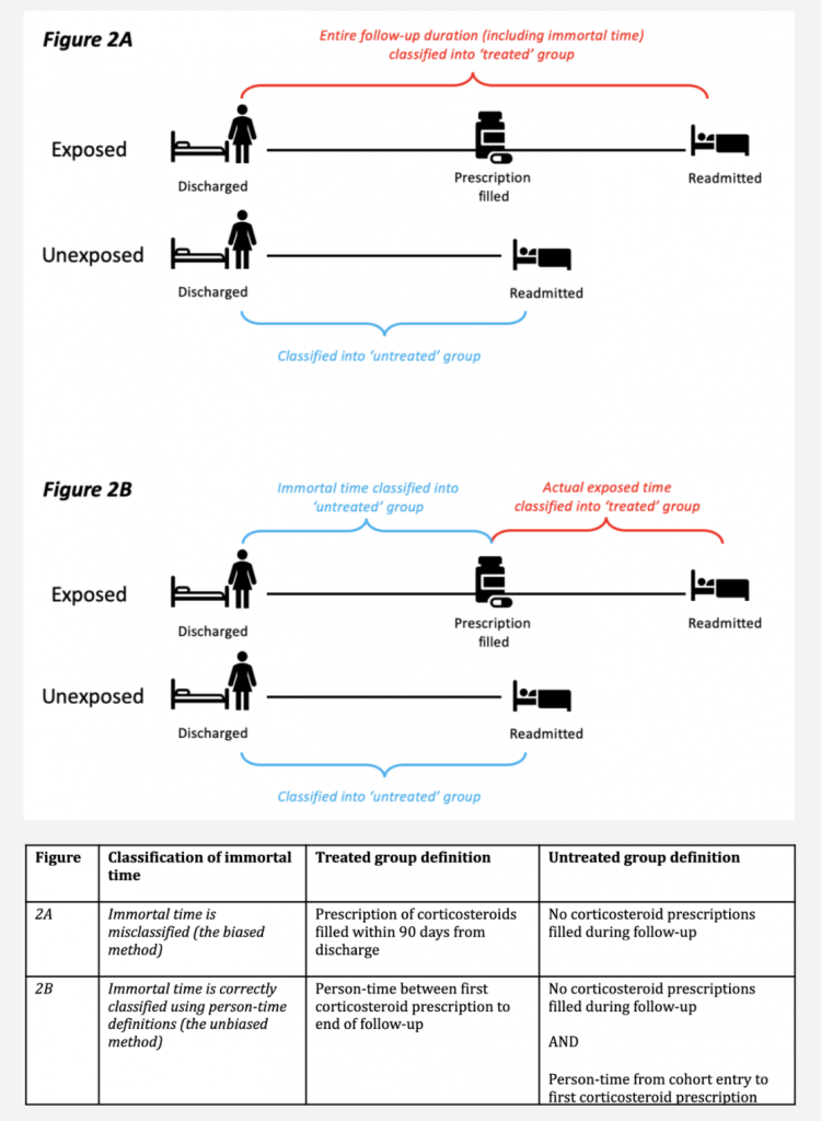
- To highlight one example, several observational studies reported that inhaled corticosteroids could effectively prevent readmission and mortality in patients previously hospitalized with COPD. In the original studies, immortal time bias was introduced because participants entered the cohort on the day they were discharged and were then assigned to the treated group if they filled a prescription for a corticosteroid within the first 90 days from discharge. By design, participants allocated to the treated group could not have died or been readmitted between the time of entering the cohort and the time of filling their first prescription. In effect, they contributed ‘immortal time’ to the treated group. The original studies misclassified this immortal person-time to the treated group (rather than the untreated group) and immortal time bias was induced (see Figure 2)
Kinds of Sampling
- Probability Sampling
- Simple Random Sampling
- The sample is a random sample of the population, where everyone has an equal chance of being selected, e.g. by using random-digit dialing.
- Rationale
- Suppose 60 percent of the population like X. The poll being random, everyone in the population has an equal chance of being selected. Therefore, for each person in the sample, the probability they like X is 0.6. The more people sampled, therefore, the more representative the sample. A sample with 1,000 participants, for example, is representative with a margin of error of 3%.
- The results may be weighted
- How Does the Gallup U.S. Poll Work?Gallup
- “Gallup weighted samples to correct for unequal selection probability, nonresponse, and double coverage of landline and cellphone users in the two sampling frames. Gallup also weighted its final samples to match the U.S. population according to gender, age, race, Hispanic ethnicity, education, region, population density and phone status (cellphone only, landline only, both, and cellphone mostly).”
- How Does the Gallup U.S. Poll Work?Gallup
- Systematic Sampling
- The sample is selected randomly, by contacting every nth member from a population list.
- wikipedia.org/wiki/Systematic_sampling
- Example: Suppose a supermarket wants to study buying habits of their customers, then using systematic sampling they can choose every 10th or 15th customer entering the supermarket and conduct the study on this sample.
- This is random sampling with a system.
- Stratified Random Sampling
- Method
- The population is subdivided into groups called strata, e.g. groups determined by age, gender, area of residence, race, ethnicity, religion, education level, income, occupation.
- A simple random sample is taken from each stratum.
- pewresearch.org/politics/2021/04/15/biden-100-days-methodology/
- “This study featured a stratified random sample. The sample was allocated according to the following strata, in order: Asian Americans , Black Americans, U.S.-born Hispanics, foreign-born Hispanics, tablet households, high school education or less, not registered to vote, people ages 18 to 34, uses internet weekly or less, non-volunteers, and all other categories not already falling into any of the above.
- The data was weighted in a multistep process that accounts for multiple stages of sampling and nonresponse that occur at different points in the survey process.”
- wikipedia.org/wiki/Stratified_sampling
- Method
- Cluster Sampling
- Cluster sampling is stratified random sampling using naturally occurring groups such as city blocks, voting districts or school districts.
- wikipedia.org/wiki/Cluster_sampling
- Simple Random Sampling
- Non-Probability Sampling
- Convenience Sampling
- The sample is a group easy to contact, e.g. how-did-we-do emails.
- wikipedia.org/wiki/Convenience_sampling
- Quota Sampling
- Quota sampling is stratified random sampling without the randomness, e.g. where interviewers select respondents using their own judgment
- Convenience Sampling
More Examples
Bad measure of Covid deaths: CDC’s provisional death count
Claim: The week that ended on July 4 showed only 71 deaths from coronavirus.
- Fox News host repeats worn-out lie while downplaying latest coronavirus death statisticsMedia Matters
- On the July 10 edition of Westwood One’s The Mark Levin Show, Levin referred to a CDC web page on running death counts by week, and claimed that the week that ended on July 4 showed only 71 deaths from coronavirus.
- As Media Matters explained two months ago, this depends on the deceptive use of just one of the two running totals that the CDC maintains. In the case of the statistic to which Levin referred, this difference in bureaucratic reporting methods uses narrower versus wider definitions of coronavirus-related causes of death.
- Daily Updates of Totals by Week and StateCDC
- Provisional Death Counts for Coronavirus Disease 2019 (COVID-19)
- Note: Provisional death counts are based on death certificate data received and coded by the National Center for Health Statistics as of November 9, 2021. Death counts are delayed and may differ from other published sources (see Technical Notes). Counts will be updated periodically. Additional information will be added to this site as available.
- Provisional Death Counts for Coronavirus Disease 2019 (COVID-19)
Comparing murders with violent crimes
Claim: “When I was vice president, violent crime fell 15 percent in this country. And most of the major cities in this country, the murder right now is up 26 percent across the nation this year under Donald Trump.”
- Former vice president Joe Biden, in a speech in Pittsburgh, Aug. 31, 2020
- First, some simple facts. When I was vice president, violent crime fell 15 percent in this country. We did it without chaos and disorder. And yes, we did it with Democratic mayors. And most of the major cities in this country, the murder right now is up 26 percent across the nation this year under Donald Trump.”
- WaPo Fact Checker
- Note that while Biden is discussing his record, he mentions violent crime. But when he discusses Trump, he talks about murders.
- There’s the separate problem of comparing eight years of data with just seven months. Criminal justice experts warn against comparing crime trends from short periods of time, such as month over month or year over year.
- Biden was clear in his presentation and he cited accurate numbers. But it’s still a matter of apples and oranges — both in terms of comparing inconsistent timelines and also murders versus violent crime.
Biden taking office preceded increase in murder rate
Claim: “Welcome to President Biden’s America”

- House GOP’s Misplaced Blame for Rising Homicides factcheck
- Homicides are on the rise, but the increase started last year when Donald Trump was president.
- Experts say there are several factors that may explain the rising number of homicides, but the president is not one of them – regardless of party.
- As alluded to by Worrall, the pandemic is believed to be one reason for the recent rise in homicides.
- In addition to the pandemic, Rosenfeld and Worrall both cited the public protests against the police after the May 25, 2020, murder of George Floyd by a white police officer.
- There are several other possible factors that may be contributing to the current rise in homicides, including a rise in gun sales and a reduction in jail populations during the pandemic, the Council on Criminal Justice says in its year-end report.
Detailed Outline
- Statistics
- Three Ways a Statistic Lies
- 1. Bogus Statistics
- 2. Misleading Statistics
- Apples to Oranges: Comparing incommensurable statistics
- Average isn’t always typical
- Bad measure of a quantity
- Bad measure of dangerous driving conditions: absolute number of accidents
- Bad measure of workforce over time: absolute number of workers
- Bad measure of vaccine effectiveness: percent of infected who are vaccinated.
- Bad measure of increase in number of young adults living with their parents: percent increase.
- Bad measure of cost per job: cost of project divided by (number of jobs at end of project minus number of jobs at start of project)
- Bad measure of fake family units: large percent change of small number of fake families
- Bad measure of progress combating pandemic: percent of emergency room visits for non-Covid health issues
- Bad measure of global death rate: number of people who die at some point divided by number of people
- Using the wrong baseline to measure change
- Cherry Picking: Selecting data that yields misleading statistics
- Broad and Narrow Definitions: Defining a statistic so it’s misleading
- Dishonest Graphs: Distorting the data visually
- 3. Invalid Inference from a Statistic
- Addendum
- Detailed Outline
